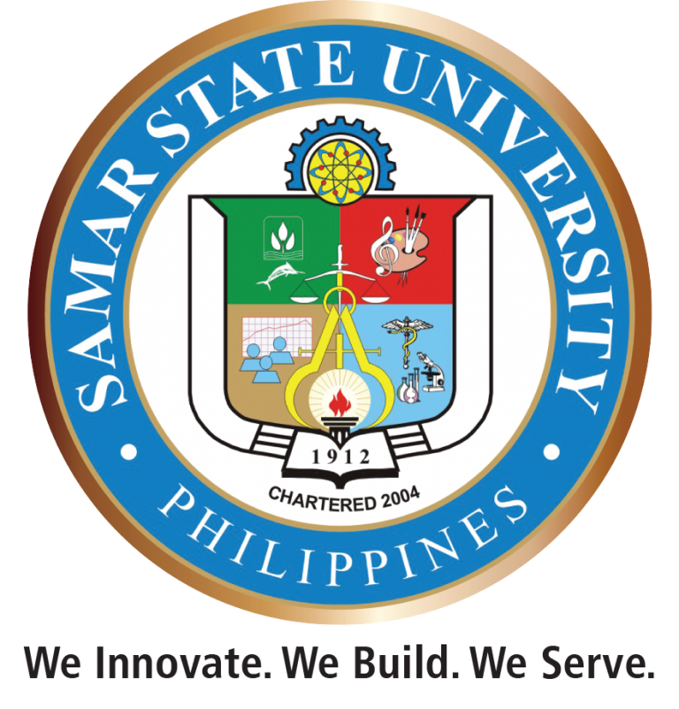
At the upper portion or the head of the logo are a half gear and a unified atom which represents the scientific and technological underpinnings of the University.
The arms and hands, outlined by white stretches, open a book encrypted with 1912, the year when the school was established as an educational institution, and lighted by a beacon signifying the educational nature of its mission.
The year 2004 indicates when the school was converted into a state university by virtue of RA 9313.
On the fields of green, symbols of a fish and a plant can be found which represent the curricular offering of agriculture and fishery of the University.
On the fields of red, symbols of G clef and a palette with paint brushes can be found which represents arts and philosophy curricular offerings of the University.
On the fields of yellow, symbols of a graph and 3 human figures can be found which represents education and engineering curricular offerings of the University.
On the fields of blue, symbols of a caduceus and a graduated cylinder can be found which represents science and technology and nursing and health sciences curricular offerings of the University.
At the center of the fields are a compass and a scale of justice.
Encircling the whole symbols is the name of the university (Samar State University) and the country (Philippines) in white over sky blue background and outlined in gold, the official colors of the University.
Placed as the cutline of the logo is the SSU Mantra “We Innovate. We Build. We Serve.” approved through Board Resolution No. 80, series of 2017.

